g_hardy open to opportunities

Metro-Atlanta area

G. Hardy

IT people leader with a passion for data — currently growing my skills as a data analyst and data scientist.

Quick stats

FocusIT leadership
Growing intoAI, Automation, and Data science
Core stackPython, SQL, PowerBI, and Tableau
Based inMetro-Atlanta

Leading teams, learning data

I lead IT teams day to day, and outside of that I've been building a second set of skills in data analysis and data science — from statistical modeling and forecasting to machine learning and geospatial visualization. I like the combination: people leadership grounded in the ability to actually dig into the data myself.

What I work with

Web & visualization

HTML/CSS JavaScript Bootstrap Leaflet.js Dashboarding

Data & analytics

Python Pandas NumPy SciPy Matplotlib

Databases

PostgreSQL MongoDB ETL SQL

Modeling & BI

Machine learning Deep learning Tableau Forecasting

Where I've worked

Senior Manager

Cox Enterprises · Start Sept. 2006 – Present

Lead a global 24/7 team managing enterprise applications and SQL databases, vendor contracts, and warranty escalations. Drive high‑availability systems and strategic alignment across Cox while spearheading AI initiatives within the Infrastructure organization to enhance automation and operational intelligence.

Previous role

Company name · Start – End

Revitalized an underperforming department, introduced workload automation (Control‑M), and fostered cross‑divisional collaboration and business continuity planning.

Selected work

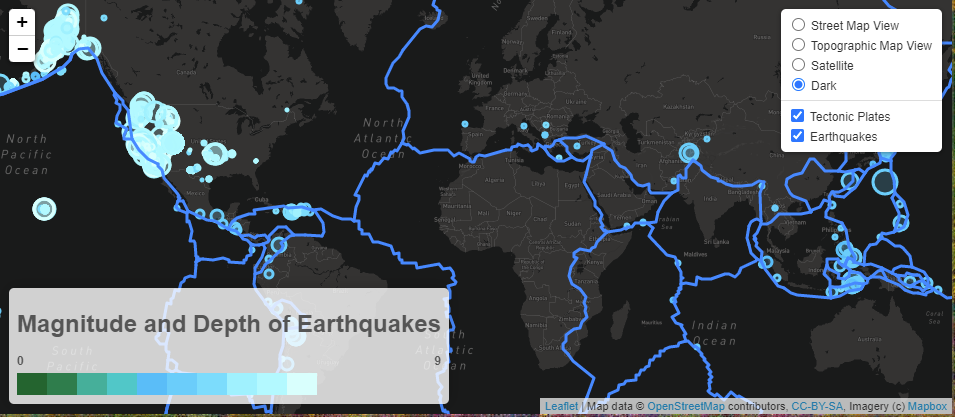
Dark-mode map plotting global earthquake magnitude and depth with tectonic plate overlays Geospatial

Global earthquake tracker

An interactive map plotting historic earthquakes by location, magnitude, and depth, with tectonic plate overlays pulled from the USGS API.

Leaflet.js · JavaScript · HTML/CSS
Analysis

Banking deserts

Combined U.S. Census, Google Maps, and Google Places data to visualize how banking access correlates with socioeconomic factors by zip code.

Python · Pandas · Google APIs · Matplotlib

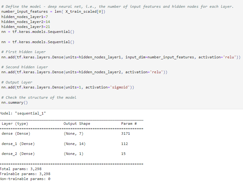
Keras sequential model summary showing layers and parameter counts for the funding predictor Machine learning

Nonprofit funding predictor

A binary classifier neural network trained on 34,000+ funding applications to predict which nonprofits are likely to succeed if funded.

TensorFlow · Keras · Python
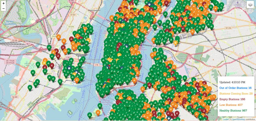
Live Leaflet map of Citi Bike stations across New York City colored by station status Geospatial

Citi Bike station tracker

Live map of every Citi Bike station in New York City, color-coded by status, plus a companion Tableau dashboard for exploring ride distance by rider type.

Leaflet.js · Tableau · REST API

Dashboard

Weather visualization dashboard

A multi-page dashboard with individual charts for weather data, a comparison view across all plots, and a raw-data view — all cross-navigable.

HTML · CSS · JavaScript charting
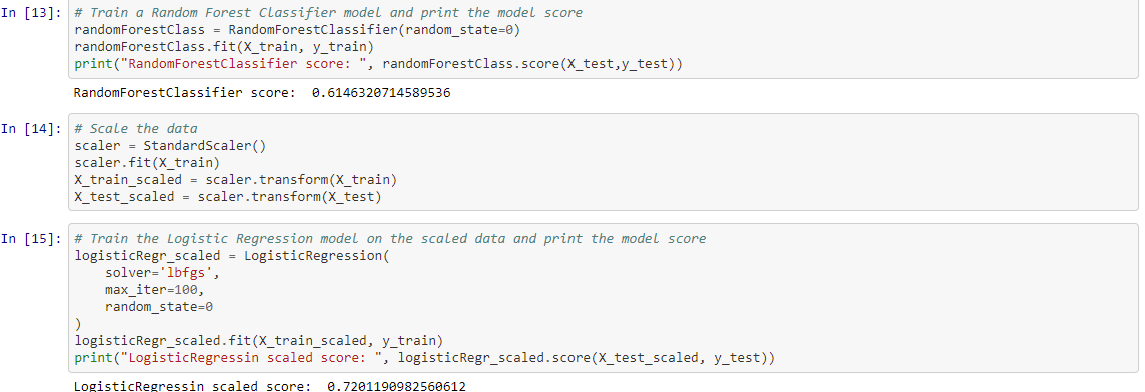
Notebook output comparing Random Forest and scaled Logistic Regression model scores Machine learning

Predicting credit risk

Trained and compared supervised models — including Random Forest and scaled Logistic Regression — to classify loan applications as high or low risk.

Python · Scikit-learn
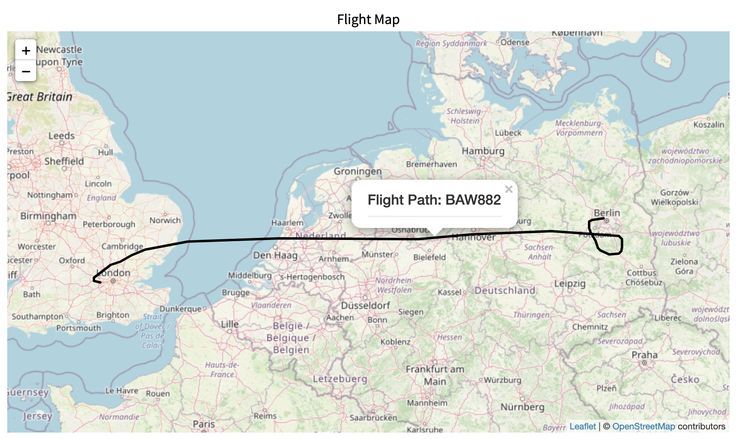
Map tracing a flight path between the UK and Germany for a tracked aircraft emergency Full-stack

Decoding aircraft emergencies

A team-built visualization backed by a Flask-powered API and database, mapping flight paths tied to reported in-flight emergencies.

Python Flask · HTML/CSS/JS · Database
Visualization

Adoptable dogs in the USA

A data visualization exploring adoptable-dog listings across the country to surface regional adoption trends.

Python · Data visualization

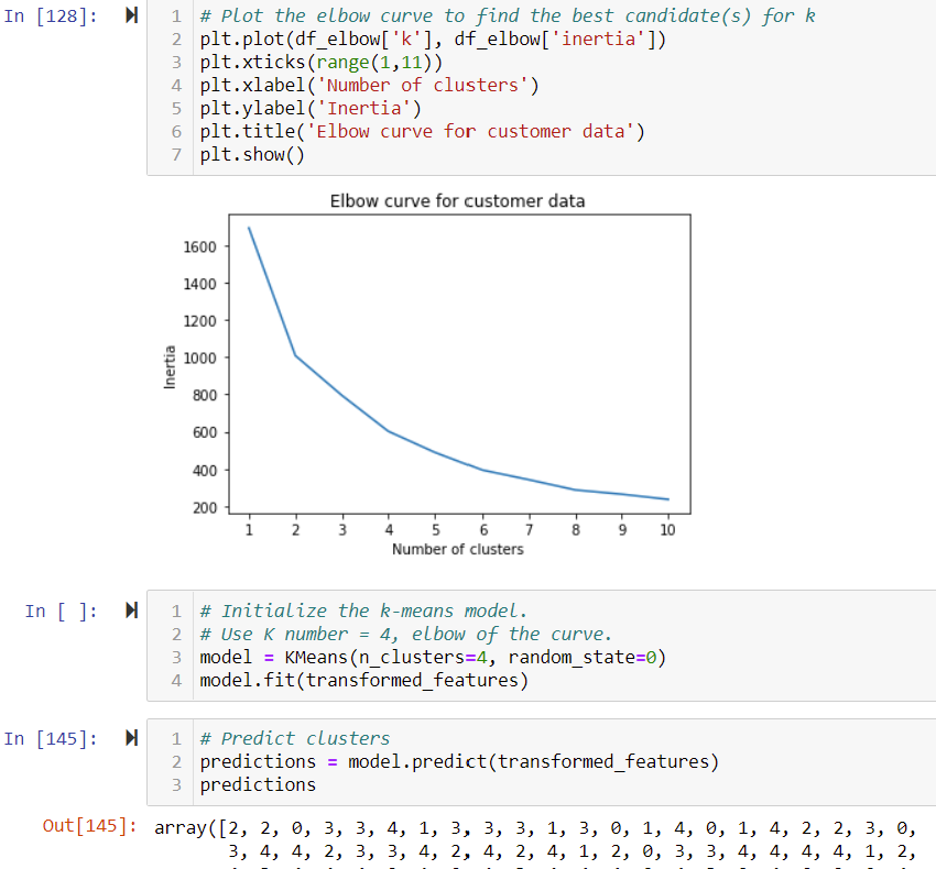
Elbow curve chart plotting inertia against cluster count to choose k for customer segmentation Machine learning

Customer segmentation

Used an elbow curve to choose an optimal k, then applied K-means clustering to group customers by behavior for targeted analysis.

Python · Scikit-learn · K-means
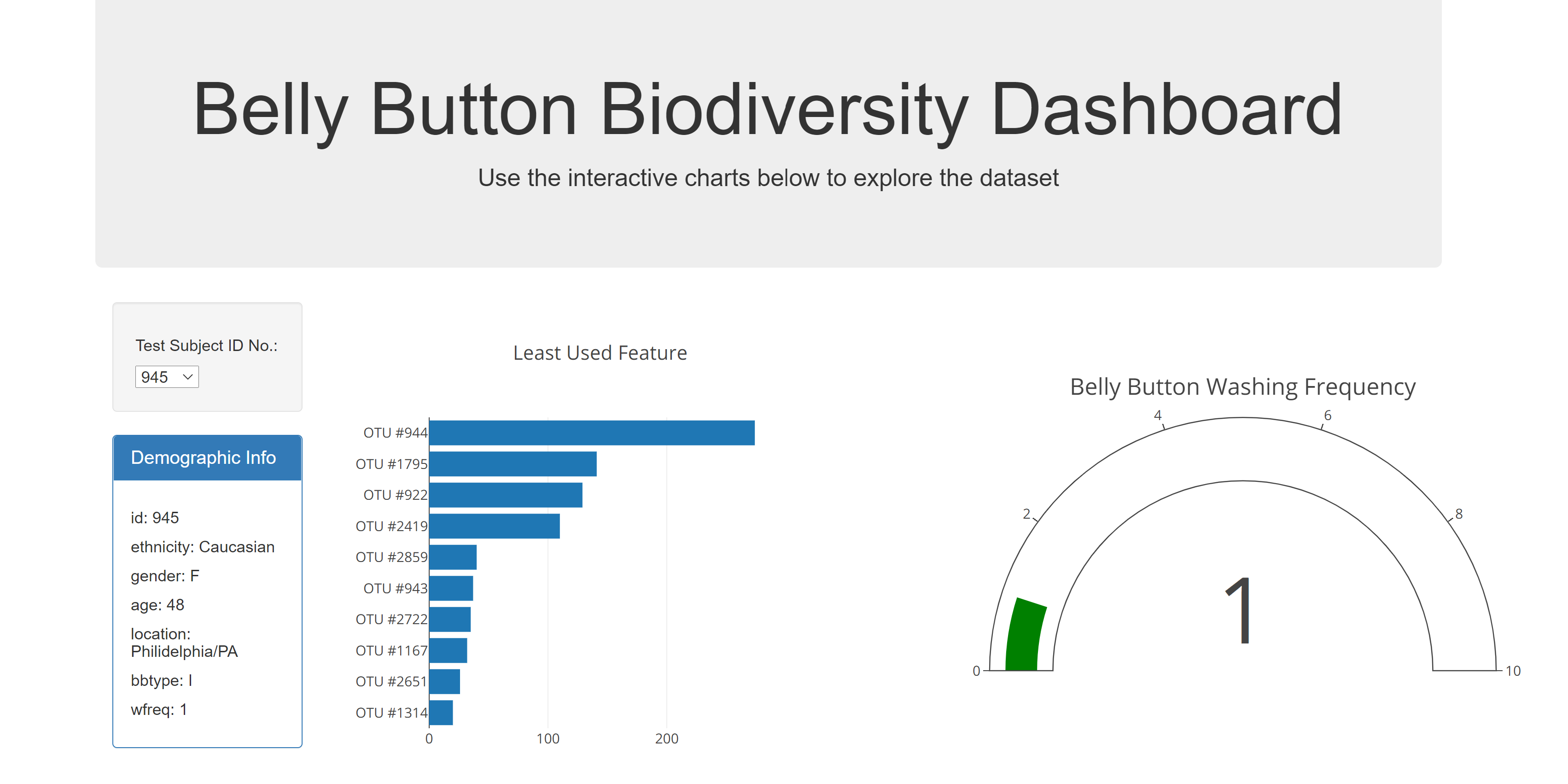
Belly Button Biodiversity dashboard with a bar chart, gauge chart, and demographic info panel Dashboard

Belly button biodiversity dashboard

An interactive dashboard exploring microbial biodiversity data by test subject, combining bar charts, a gauge chart, and demographic detail.

Plotly · JavaScript · HTML/CSS

Let's connect